Featured
Super Rugby Kits 2016: The Good, the Bad and the Downright Dreadful
We get our fashion-police on and give our thoughts on the 2016 Super Rugby jerseys.
This last weekend saw the long awaited return of Super Rugby, and what a weekend for rugby it was. The tournament’s opening round saw a shock victory for the Jaguares against the Cheetahs and a 52 – 10 routing of the Hurricanes by the Brumbies. The first weekend is pretty much an indication of how the teams will set up tactically for the rest of the season, what sort of momentum they will have going forward in the competition, and where adjustments need to be made. For a lot of rugby fans worldwide, it is also the first glimpse of the new kits our favourite teams will be wearing (and supporters will shell out some serious money for).
Here is MenStuff’s list of The Good, the Bad and the Downright Dreadful.
THE GOOD:
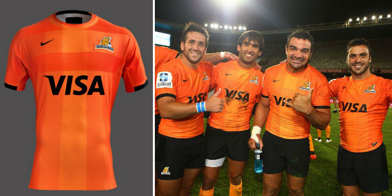
Hands-down, the best kit of the 2016 season goes to Los Jaguares. The Argentinian franchise has started their season is off with a hard fought victory – they played most of the first half with 13 men and a 20+ point deficit. Nike has created a modern classic for the Argentine outfit’s first season in Super Rugby. The strength of the kit is the subtle textures echoed in the home (black kit) and away (orange kit). The kits are bold but read well aesthetically and are quite elegant – not something usually associated with rugby.
Runner up:
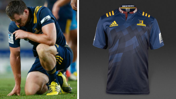
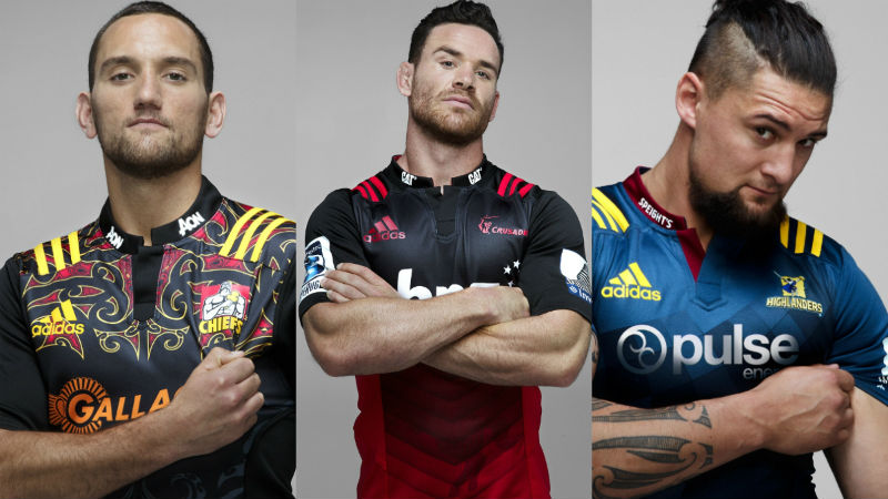
Although the Highlanders recorded their first loss of the season, they are on our winners-list for this season’s top kits. The Highlanders’ home kit is well crafted, has interesting details and a rich pallet. The burgundy collar detail on the blue shirt looks luxurious but is offset with the sporty, yellow shoulder strap details (that all the Adidas kits have). The shirt itself changes from a light navy blue to a much richer, dark blue. The grading patches of blue reference the tartan pattern highland kilt but give the kit a modern spin. The away kit is slightly less successful. It is the same kit just in white and green. It looks neat and works well.
Special mentions: The Stormers Away Kit, The Reds Away kit (takes its cues from Paris-Saint Germain’s home kit), the Rebels (both home and away kits are great), the Lions home and away (teetering on kitsch but looks like it will become a fan favourite). Cheetahs Home Kit.
THE BAD:
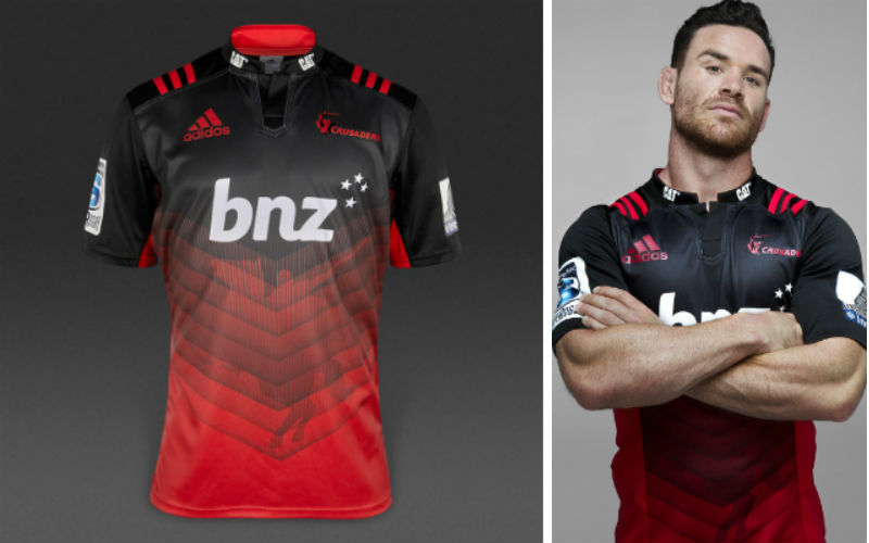
The Super Rugby 2016 season seems to be the year of the watermark. Too many teams took to literally translating their brand into the kit via the time-tested watermark. The Crusaders, who lost to the Chiefs in a 21 – 27 battle on Saturday, were so close to having a decent strip. The ‘Saders ran out with a kit that radiates from black to red through a chevron like geometric pattern that becomes obscured by a watermark of… you guessed it… a crusader.
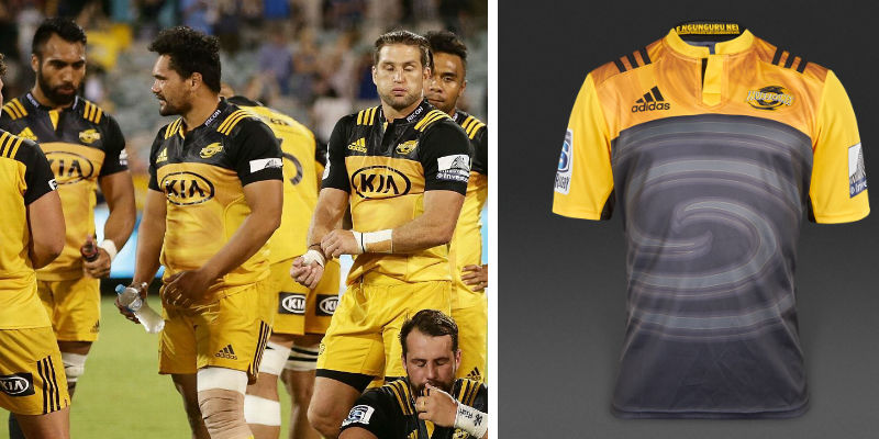
The Hurricanes, another of the weekend’s less successful teams, have a watermarked hurricane-like swirl; the Sunwolves have an imprinted snarling wolf (this is the best use of a watermarked kit in 2016, to be honest); and the Cheetahs – beaten by Los Jaguares in Friday’s epic clash – have a stylised cheetah watermarked on the shirt’s midriff*. After more consideration, I suppose it’s a bit harsh for this kit to be on the ‘bad’ list, because it is one of the best watermark kits, although some more variation could’ve been introduced.
Special mentions: The Sharks, EP Kings
THE DREADFUL:
There is a tie for last place; it is so difficult to decipher which kit is more appalling.
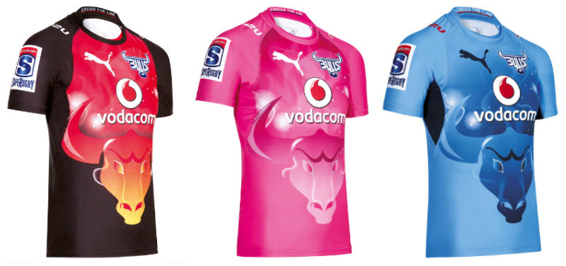
The Bulls had an awful start to the Super Rugby season with a 33 – 9 loss to the Stormers. To add insult to injury, they will be wearing one of the worst kits in modern history for the rest of the season. The team from Pretoria’s kit has a uni-browed bull set in the middle of the shirt, under what looks like a night sky. What sounds like a good idea for an indie-folk music video, doesn’t work well for a rugby kit. There is not much that could make this kit worse… oh, wait, it comes in burnt sienna and black, and pink.
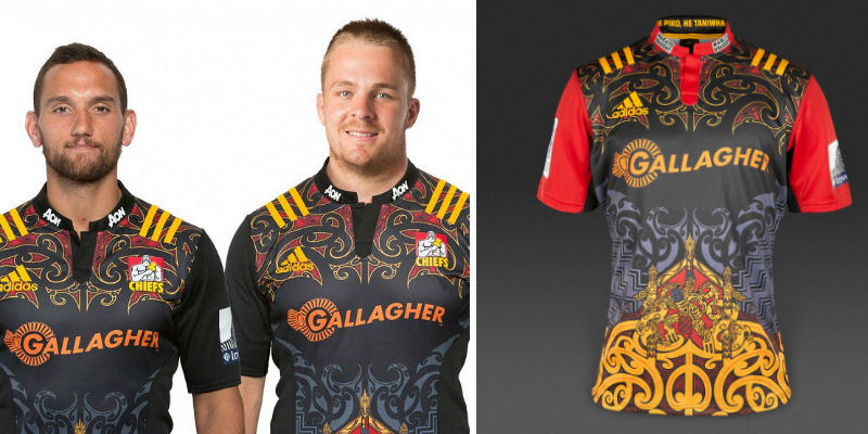
The Waikato Chiefs, winners on the opening weekend, used to have a bold but simple kit made up of black shirt, yellow breast plate and red sleeves. 2014 saw a change in the north island team’s kit, with the introduction of a new graphically heavy shirt. This re-branding celebrated New Zealand culture and heritage, in a balanced but still quite visually busy shirt that became a fan favourite. 2016’s kit sees the return of those ideals but on steroids. The new Chiefs kit is too much to take in; there is too much going on to focus on any single detail. What it does have going for it is: symmetry within the pattern and balance to the swirling lines. The Away strip looks less obtrusive with a white kit and light grey detailing. So, on this basis, I actually think the Bulls have won the battle for the worst kit of 2016.
*THE CHEETAHS DIDN’T PLAY IN THIS KIT ON THE OPENING DAY BUT WILL BE WEARING IT DURING THE REST OF THE SEASON.
What do you think of the new Super Rugby kits? Let us know in the comments below and tweet us @MenStuffZA.

